
e-tennis
Competitors analysis & B2C UX/UI improvements in the layout
Role
Sole UX Designer:
Competitive analysis, storyboards, GA analytics, usability testing, sitemap redesign, user flows, empathy map, affinity mapping. I was hired by the digital marketing agency Not the same to perform UX/UI analysis for e-tennis.
Goal
Increase company’s profit, improve UX, find what is missing based on data from competitors research.
Timeline
Jan-Feb 2021
Client personal review
“Eleftheria is a very efficient professional to work with, her analysis was to the point with valuable changes for the e-shop.”
Makis Tseheridis, CEO & Marketing director of Not the same
Deliverables
Recommendations for improving, the user experience in the new website
Client presentation
Qualitative & quantitative data from competitors research
Re-design solutions based on data from Google Analytics
Users analysis through, persona, user flows, storyboard, empathy map, experience map
Overview
With the launch of the new website, we wanted to make sure we have everything that the users need and we stay on top of things with finding gaps in the market.
Competitive research
My client asked me to find what is missing from their website that the competitors have. He provided me with 5 competitors and I divided them into direct and indirect on the Miro board. I received all the important features from there such as delivery costs, IA on the homepage, the outline of the PDP and, I added them into tables to see what we are missing and where is the gap in the market.

Table with main differences from competitors
Key takeaways
•Save space, fewer products in each line, option hide filters/revisit
• Storytelling photos and engaging titles on the homepage
• Interactive ways to engage clients with social media
• Add offers on basket/checkout
• Sales category on the main navigation and more often visible
• Comparison icon more visible
• PDP product characteristics closer to price, related ones bottom of the page
• Tags on products
This table was the most valuable deliverable as my client was very happy to receive it. He took it and as he mentioned he sat down with the rest of the team from the e-shop and made the appropriate changes. It was aligned with the main business goal which is to improve the financial income, this could happen by making the users’ experience easier and providing them with things that were missing but also giving them the opportunity to experience features that couldn't find in the rest of the market through our competitors.
Usability testing
I did usability testing with 3 users in 3 different levels to point out the differences that a junior level tennis player and an advanced player are having and discover their pain points during the visit to the site.

For this reason, I picked a leisure player that started recently to play tennis during the lockdown, as it was the only sport you could play, an intermediate player that in her childhood used to compete professionally, and a tennis coach with 20 years teaching experience under his belt. The testing took place through Zoom.

Screenshot from usability testing
I consolidated the findings and performed an affinity mapping to see the main categories of pain points that the users had, hence what areas need improvement.

Affinity mapping on Miro board
Testing key takeaways
• The site is more user friendly for the advanced person
• They couldn’t find the comparison icon
• All see sales first when shopping online
• They found it difficult to navigate in the sales section
• Like to see the characteristics closer to the product
• Would love to see related products on the basket
• Users will consider checking out as member if there was a trigger point, discount code for the next time that will shop, free delivery
User’s profile
I created a persona, based on the data I received from the usability testing and the GA analytics, a storyboard about a pain point when visiting e-tennis, an empathy map to see through the persona’s eyes how they feel and react and finally, I gave a scenario-task to complete in e-tennis but also in two competitors, from this I would understand any distractions in the steps through their journey on shopping online.

Persona
Situation: Antonis wants to purchase his first tennis racquet
Problem: It's complicated to decide, lots of products with inadequate information
Solution: e-tennis posted a blog on how to choose your first racquet
Outcome: Antonis is happy with his choice and purchase
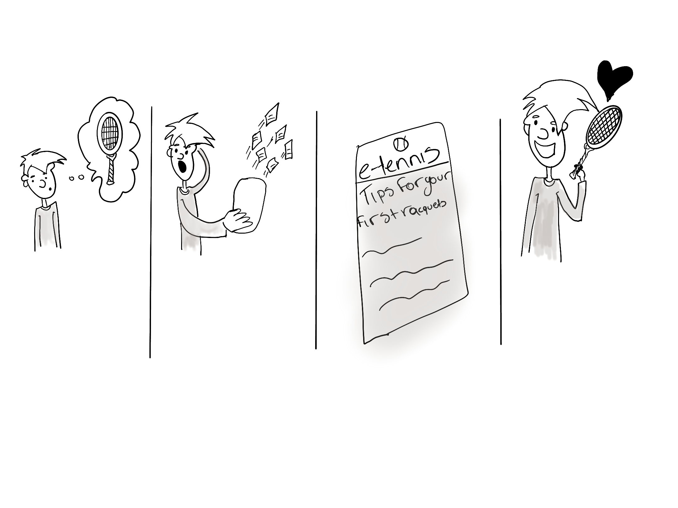
Storyboard: one of the main points was that junior-level users were struggling to understand what is the best racquet. The reccomended idea here creates solid newsletters with information for beginers.
Sitemap
To understand why the users expressed as a pain point, that they couldn’t find certain products and if they knew that these products existed they would purchase them, I mapped out e-tennis and from two competitors (one direct - one indirect) the site map. I took all the relevant notes and differences on the product categories such as, what is the CTA for each company and how easily findable a product is. I also checked the best-selling products from e-tennis through Google Analytics and I suggested a few changes.
The key takeways were:
Best selling product was shoes after rackets
Think of kids level category
Add rackets stringing under rackets
Add sales section on the main navigation menu
Add color on the titles and change sizing, UI
Add trustworthy 3rd party section on the footer
Test product categories with users

Sitemap
Outcome
A presentation with the CEO of e-tennis and the CEO of Not the same agency, and a UX/UI analysis of the main points that need to change with recommended options.
Difficulties & reflection
It was great working on this project with two exceptional individuals who have many years of experience in Tech and marketing. The greatest lesson for me in this project was how to best present the findings from my research and how to tie them into the business goals within tight budget constraints, but still provide the best value and insights.
Next steps
• Make relevant changes
• Track them from Google Analytics
• Test the new site with more users
• Reconsider loyalty program