Upwork
Overview
For my 3rd project at General assembly, I had to design a new feature for the Upwork platform. It was a one week group project of 4 people. Upwork is a website that helps freelancers in the Tech industry to find work. The feature we were asked to add was a volunteer section, where freelancers could update their skills and work on real life projects as volunteers. Luckily enough, that was a group project and I had the chance to work with an amazing group of people, where we could divide the load of the project.
For full case study visit medium https://bit.ly/32aob68 .
Client Brief
Upwork connects businesses of all sizes to freelancers, independent professionals, and agencies for all their hiring needs. Through Upwork, professionals work on projects from web and mobile app development to SEO, social media marketing, content writing, graphic design, admin help and thousands of other projects.
Project Brief - Problem
Upwork would like to do more to help their freelancers develop their skills whilst contributing to good causes, by enabling them (and anyone else) to find volunteer opportunities that match and develop their skillsets.
Features
● Ability to browse volunteer opportunities
● Ability to create/use a profile in order to be better matched to opportunities
● Ability to apply for opportunities directly on the platform
My role
User interviews, surveys, competitor analysis, experience mapping, leading and participating in the design studio, affinity mapping, ideation, usability testing, wireframing, and building the mid and high-fidelity prototype with the user in mind.
Deliverables
Survey, user interviews, competitor analysis
Affinity map, persona, empathy map, experience map, storyboard, problem statement
Design studio, retrospective, impact vs. effort matrix, site map
Usability testing, low/mid/high fidelity prototypes and a style guide
Competitive research
We did competitive research with direct and indirect competitors to evaluate similar businesses. We researched 8 business recruitment and volunteering platforms.
These were the main key findings:
Recruitment platforms tend to focus on qualifications, expertise & activity on the job.
Personal profiles on volunteering sites tend to focus on: causes to care about, skills you have.
Volunteering websites tend to focus on their mission and how you can help their specific cause.
Where Upwork stands in the market
Users and audience
We conducted a survey to determine what was stopping the volunteers signing up and what prompts them to volunteer their skills. We received 30 replies and interviewed 16 for further details.
Pain points
Most people struggle to find a volunteering opportunity that matches their skills
People don't trust the listings online
Reviews would help in building trust in the volunteering opportunity listing and the website
Time is a big issue for most people when considering to volunteer - they would only do it for a short amount of time
Process and what I did
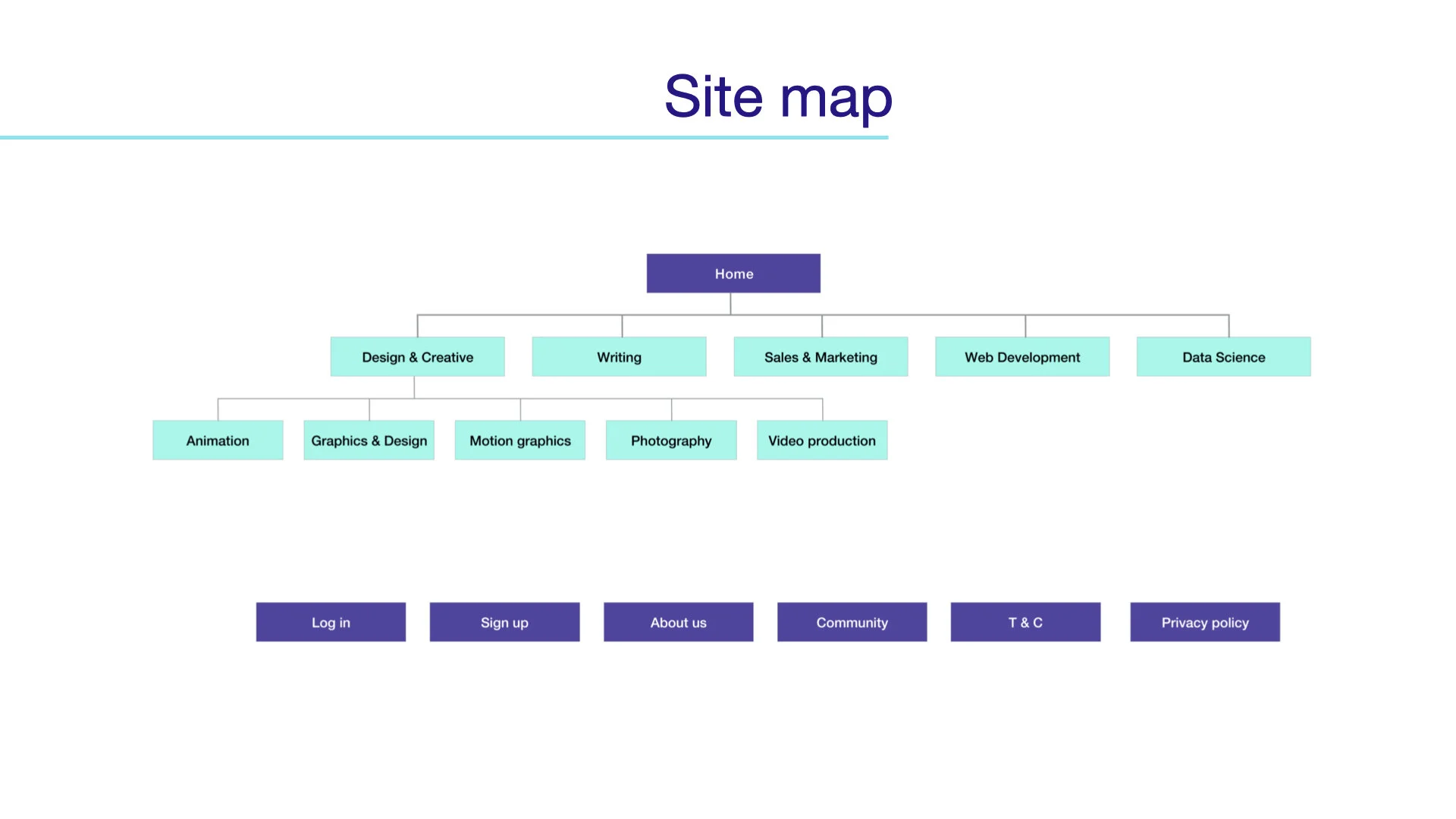
Following the competitive analysis and the personas, I continued with analysing the site map and how the navigation in our website would look like. The way the categories divided was based on the findings for the user interviews and our competitor research and how the current Upwork website has the professions divided. I specifically designed the old and new sitemap, I transferred the mid fidelity wireframes into high fidelity, I created the final presentation after getting all the data from the rest of the team. I created the questionnaire with Survey Sparrow and performed 6 user interviews.
Based on the previous research, we moved onto designing lo -fi sketches: between each stage, we performed usability testing for potential users.
Information architecture
Sketches-iterations
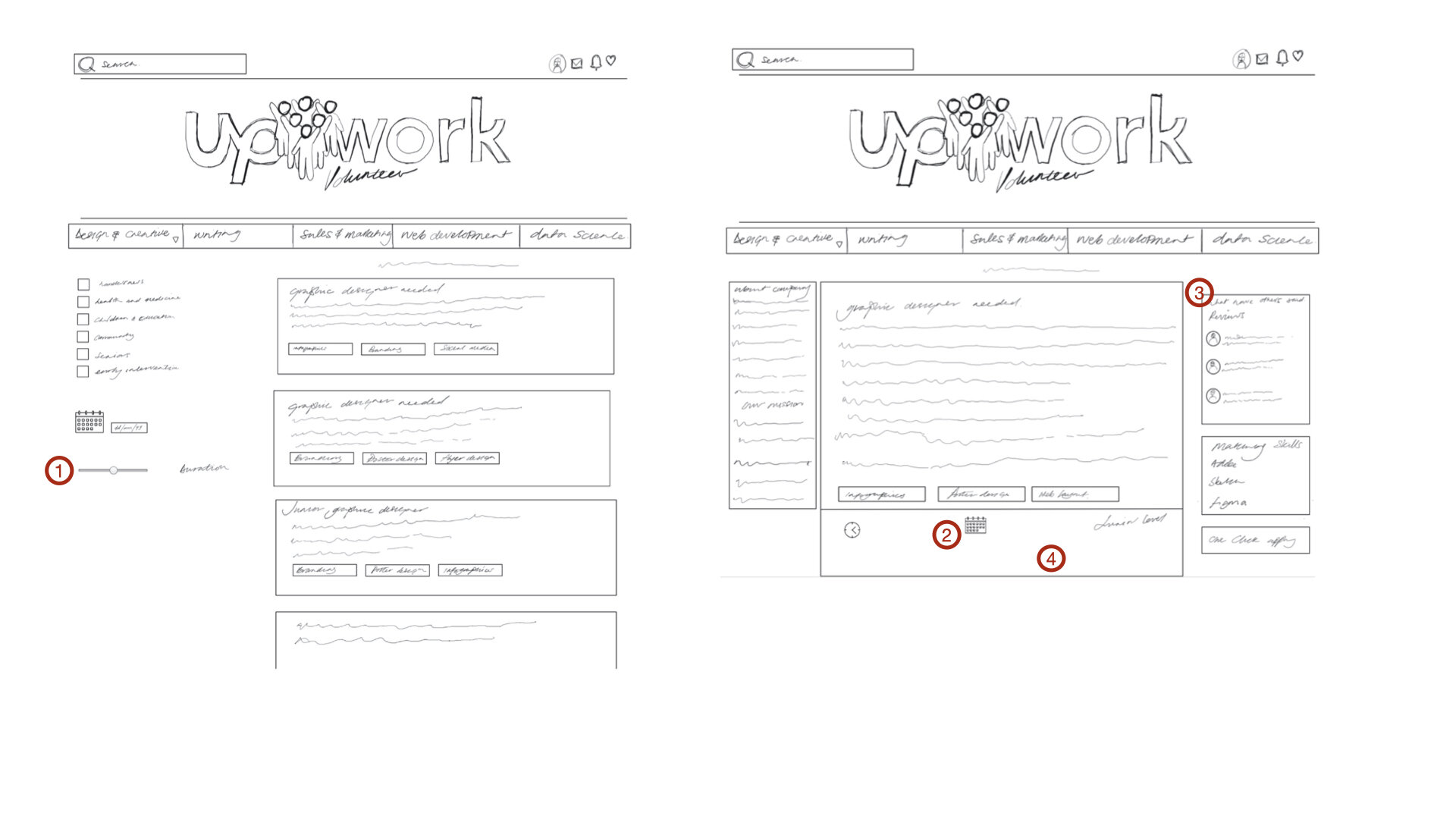
Sketches from job listing page & job display page
After interviewing and testing the users, we have decided to add this feature which highlights the exact duration of each volunteering position, as in freelancers this came up as one of the main pain points.
Testing showed that the users were expecting to see the exact date of the job first, so in the lo-fi wireframes, we positioned the calendar higher up above the job title.
Following the competitive analysis, we found a gap in the market none of the competitors had the option of contacting previous employees/volunteers that worked in this company. One of the pain points that the users had in volunteering positions was how the managers were treating them, it was crucial for us as designers to give the opportunity on feeling safe when applying for a job by asking people that already worked there how was the experience.
Lessons
Adding a new feature in an existing platform can be tricky, as you need to consider all the current users that are already using the platform. The brand environment and values. Anything new that doesn’t meet these can look strange and unfamiliar and lose the trust of the current users.
Future Steps
Test high fidelity
Add quiz skills test
Bigger mentorship program workshop with the mentors that are available
Responsive website with accessibility
Reflection
Working as part of a multidisciplinary team with different backgrounds was the most valuable lesson from this project. As a team, we focused on each other’s strengths, provided constructive feedback, and looked at our work with a critical eye. Expressing our opinions enabled us to move from designing a feature within the constraints of Upwork’s current framework, to create another website that was still consistent with the core offering.
Final wireframes
(Just a few examples video link below for the prototype.)
Prototype link:


