
FundOnion
Improve the user flow in a fintech company for a design task
Role
UX/UI Designer
Competitive analysis, information architecture, user flows, content prioritization, sketches, wireframes, lo-fi, mid-fi, hi-fi, styleguide, creation of UI library.
Goal
It was given to me by the CEO to redesign the third page in the user flow. This was what he mentioned to me:
I don’t like it
The less sophisticated page
You have to read everything
It is not easy
Maybe change the button or the way it’s expressed
Big drop out
Important to state how long they were trading if it’s under 3 years
Timeline
5 days
Deliverables
A new page based on the current user flow
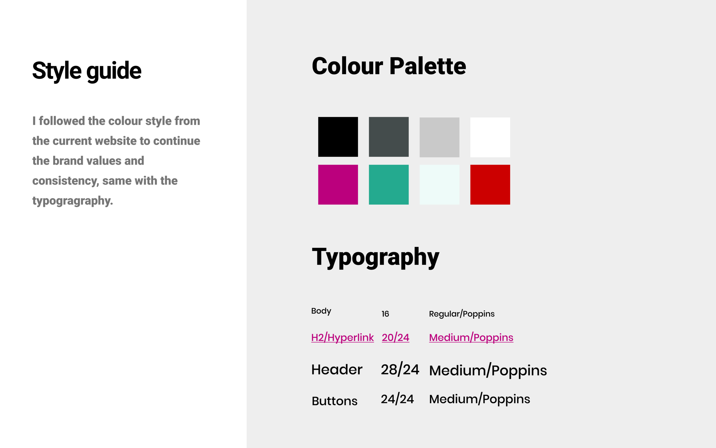
Styleguide
UI library
Overview
The CEO of the company approached me to redesign the third page of their current user flow. This was a design task for a job interview. FundOnion is a fintech that matching small businesses to the best funders in 90 seconds or less.
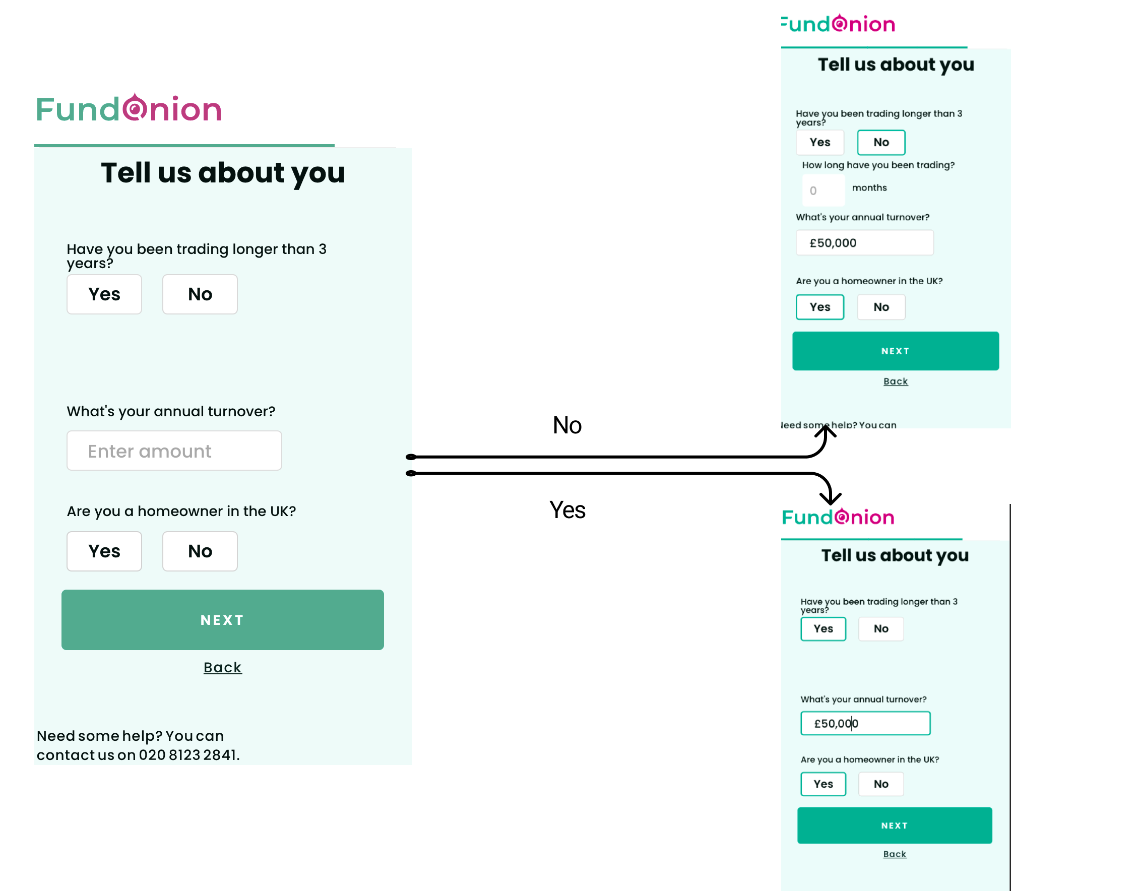
Current Page 3
Design process
I started with a competitive analysis to get inspired. I looked into 3 competitors Generation Home, Funding Options, Gov.uk
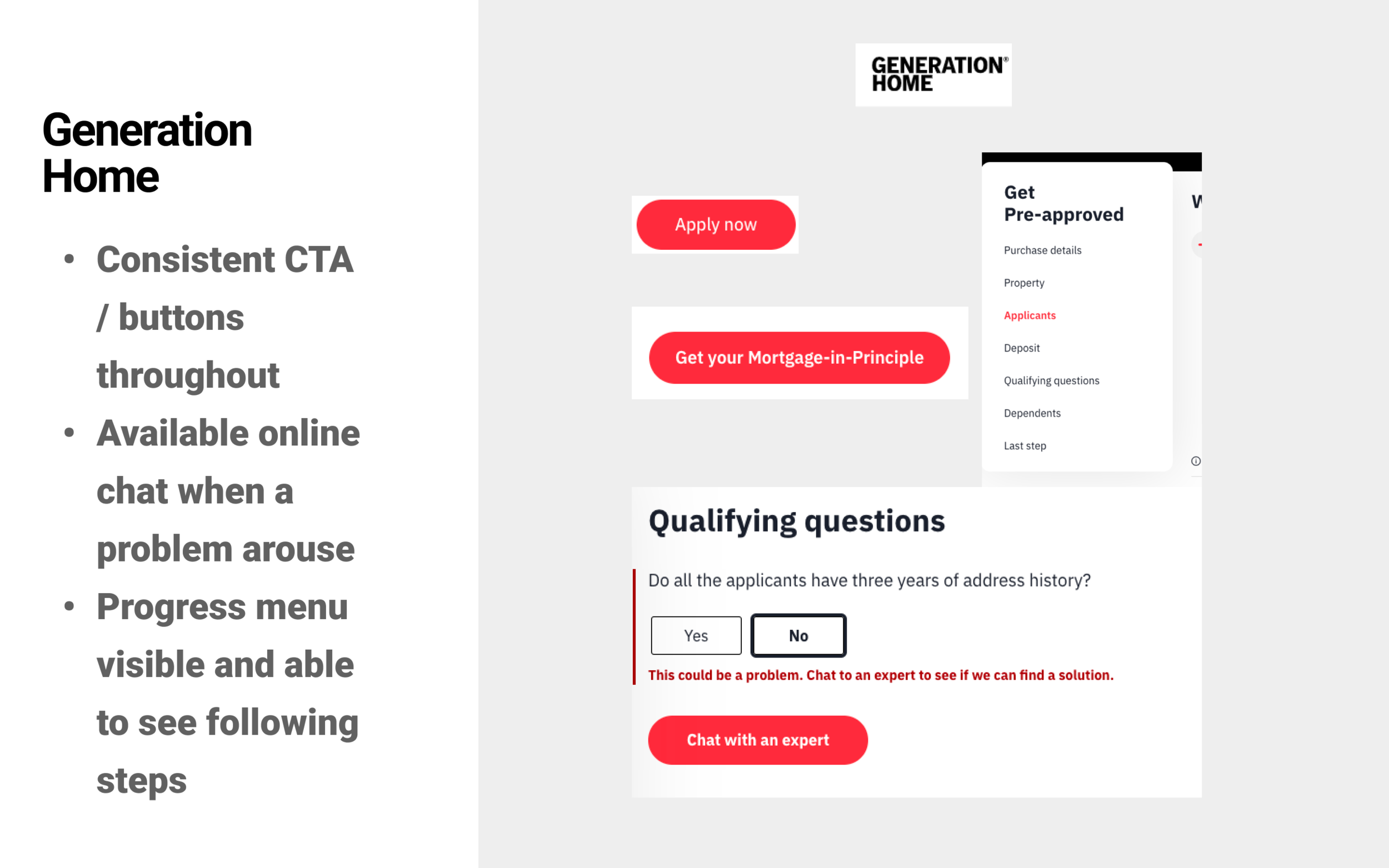
1st Competitor Generation home
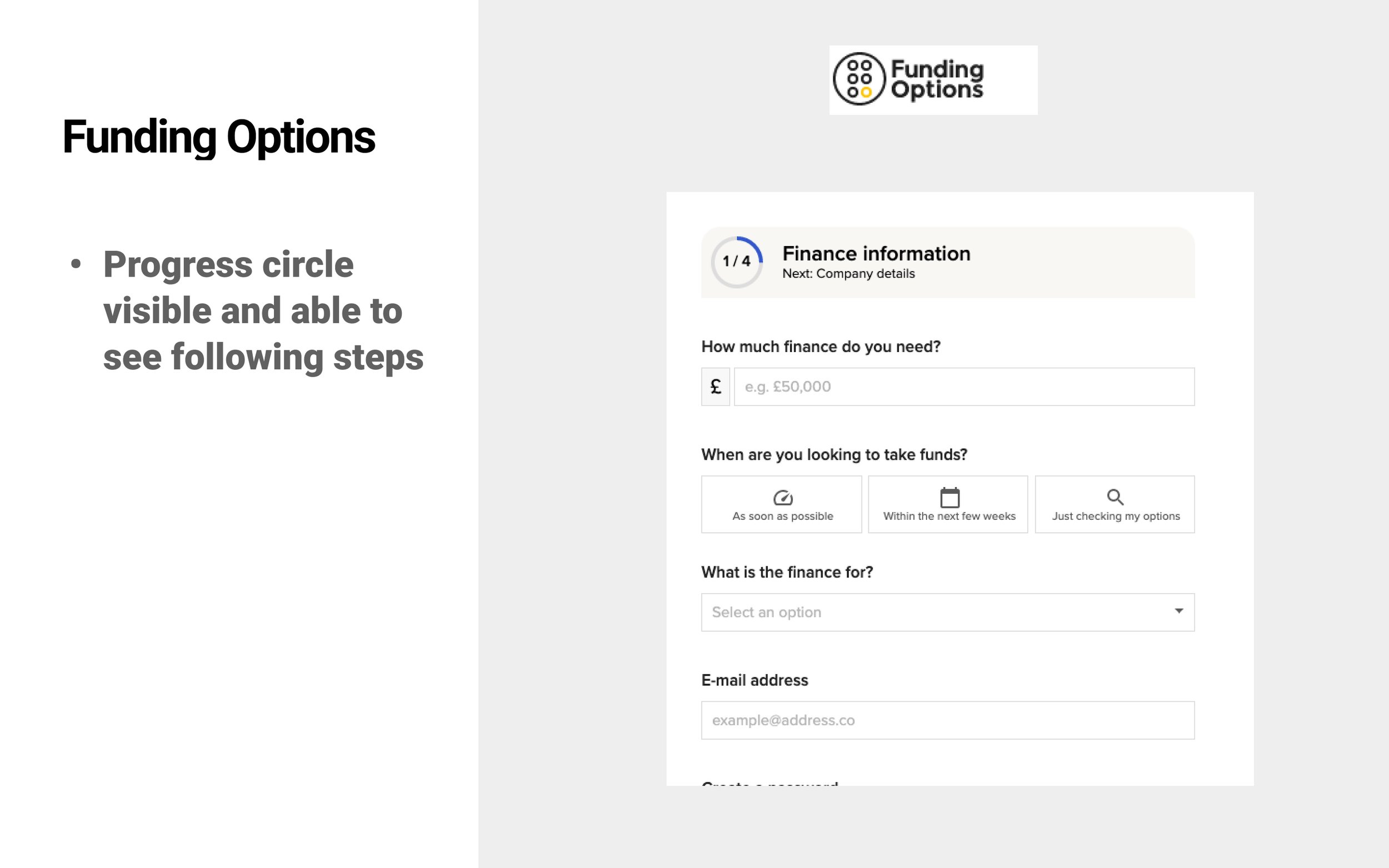
2nd Competitor Finding Options
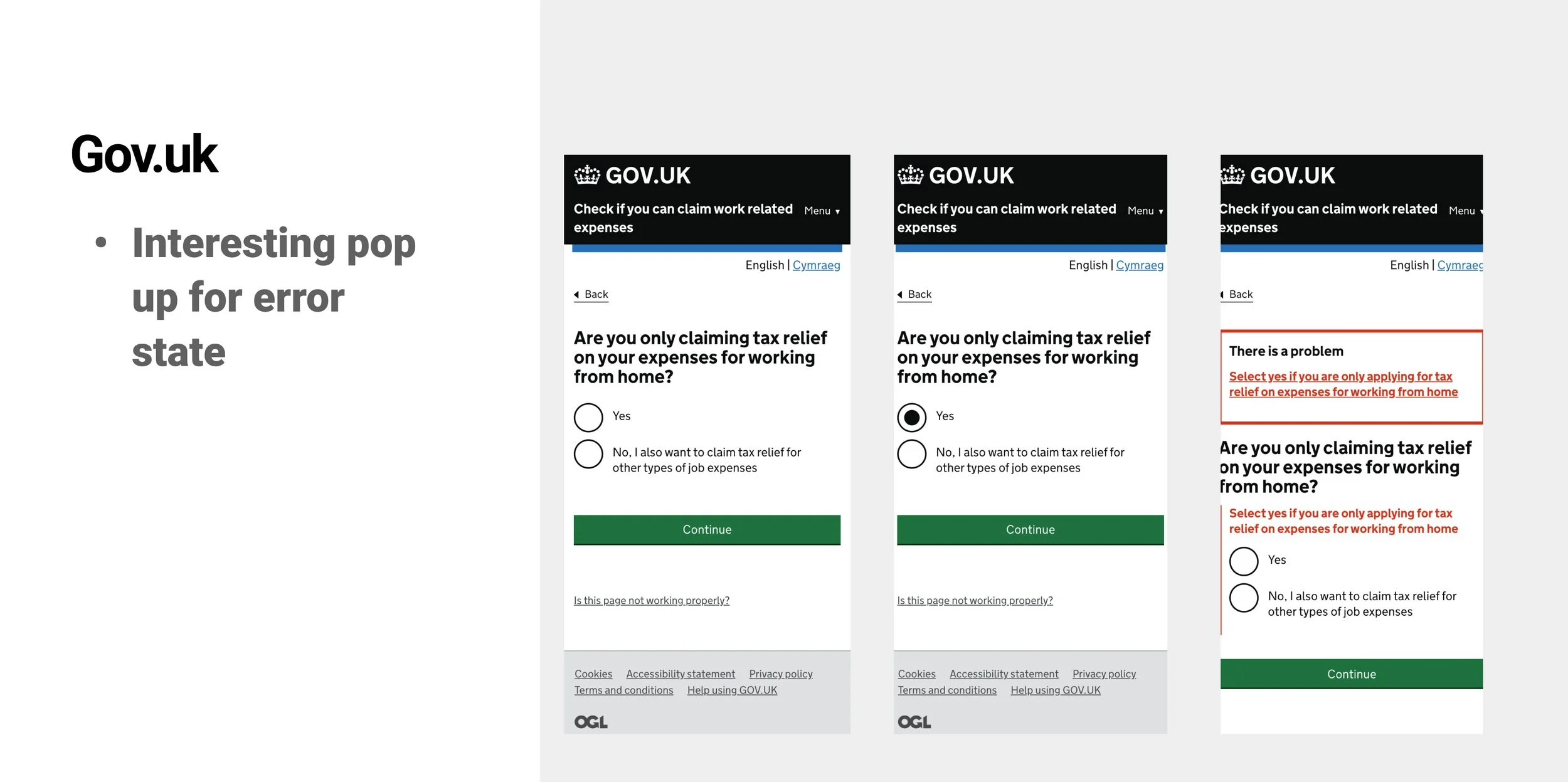
3rd Competitor Gov.uk
Current flow
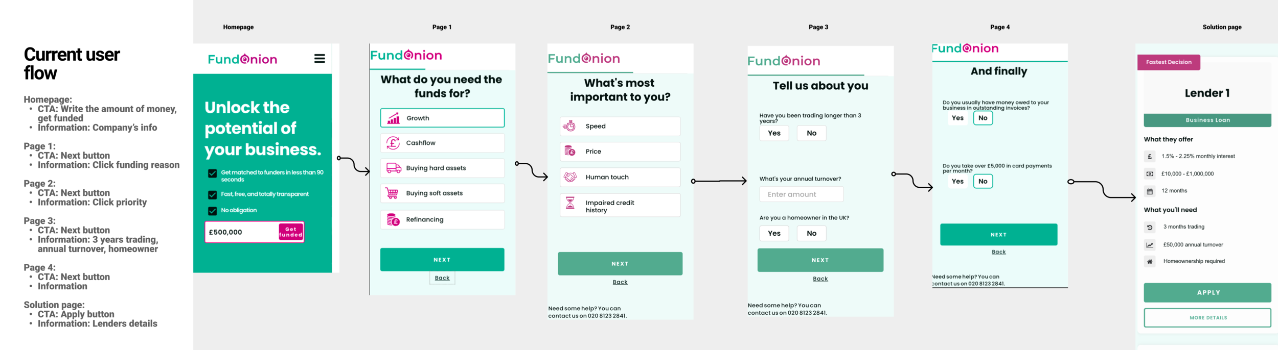
Curent flow
Analysis of current flow
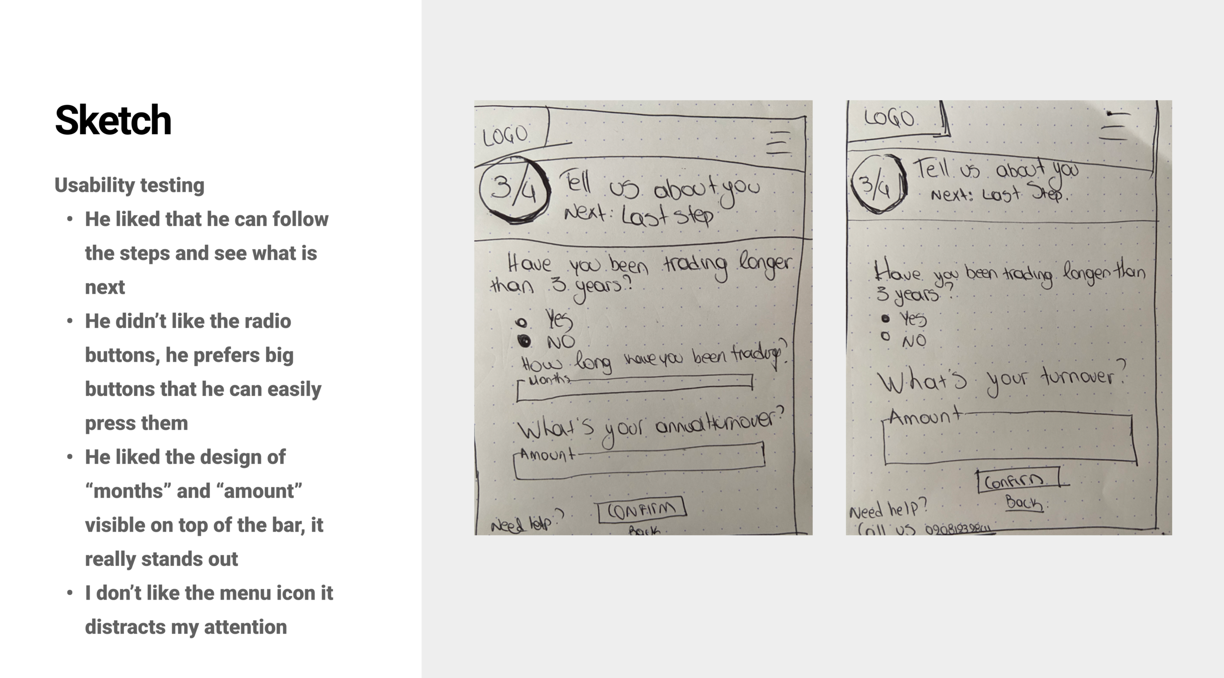
I started with testing the service with Usability testing for a user who owns a medium-size business and he could potentially use the service that FundOnion is providing.
Testing Key takeaways:
He didn’t see the progress bar
He didn’t see the contact number on the first page
Clear content description
Easy & understandable flow
It’s good but it can get better
Nothing stands out
The logo is not prominent
Onion reminds me of layers and I didn’t see any layers

Designer’s points
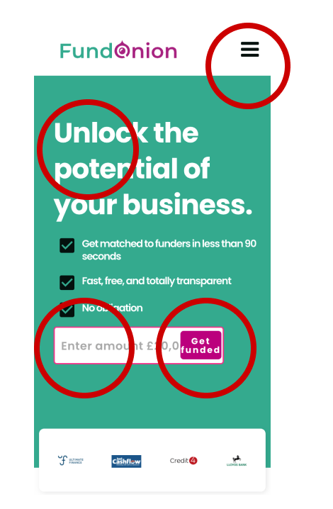
Homepage
1. On the homepage there is a burger menu button that disappears on the next screen.
2. The green/white contrast fails the accessibility contrast.
3. The focus state of the text field is done using a purple highlight border.
4. The text in the CTA wraps (bad practice with no padding).
5. Is our primary color button green or purple? Based on this screen it should be purple on the next screens.
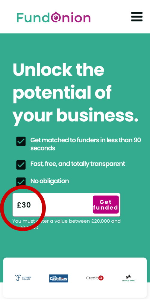
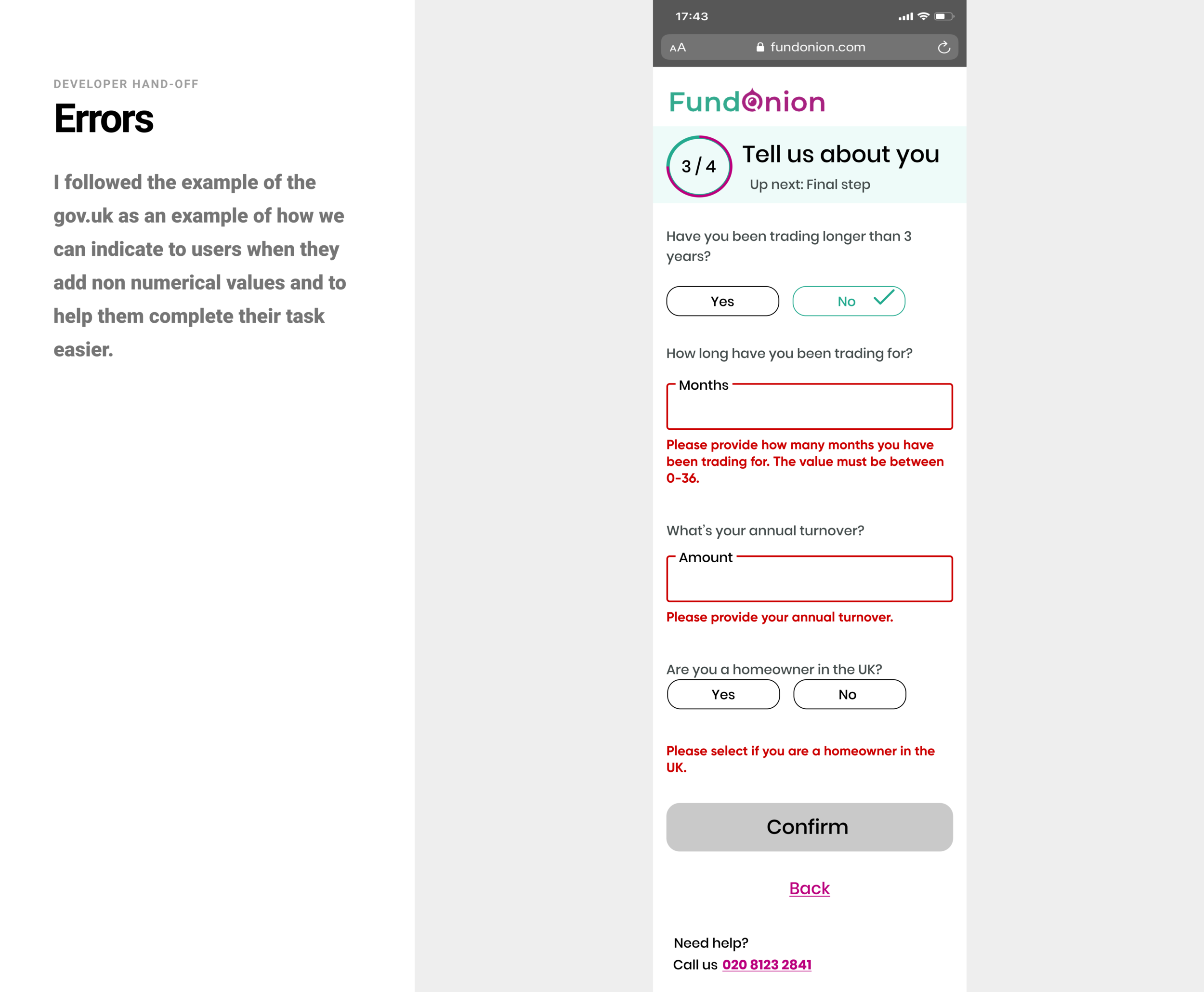
1. The error state of the text field is with white text under the field, not accessible and clear.
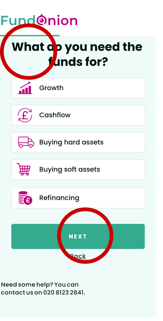
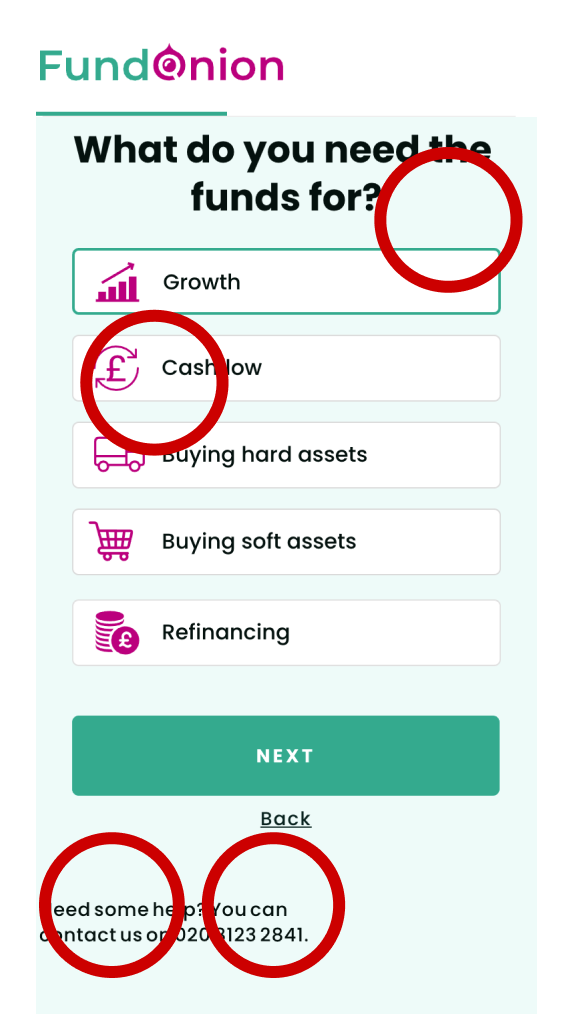
1. If the user doesn’t select one of the options and taps the CTA, then there is no feedback to the user as to what is missing.
Solution:
a) Disable the CTA until there is a selection
b) Feedback user with a notification as to what needs to be done.
2. Back button is very close to the CTA, as a result, users may accidentally tap the wrong button.
3. The human eye in western countries reads from left to right so left alignment is better UX practice
4. The user doesn’t know what the next steps are
Solution
Add a progress menu or circle
1. There is no burger icon at the header now.
2. The selected state of the field is green now.
3. The side padding is missing.
4. The phone is not clickable.

1. Vissulay inconsistent gap, looks buggy.
2. Fails accessibility contrast check placeholder and button.
3. If the user doesn’t select one of the options and taps the CTA, then there is no feedback to the user as to what is missing.
Solution:
a) Disable the CTA until there is a selection
b) Feedback user with a notification as to what needs to be done.
4. Next is not a good practice for a copy on a CTA. The user is not getting any information as to what’s coming next.
5. The human eye in western countries reads from left to right so left alignment is a better UX practice
Difficulties & reflection
The deadline and the timeline were tight on this task, but it was a great challenge to realize how to prioritize tasks, teach myself to be calm, and not let the stress affect my work.
Iterations

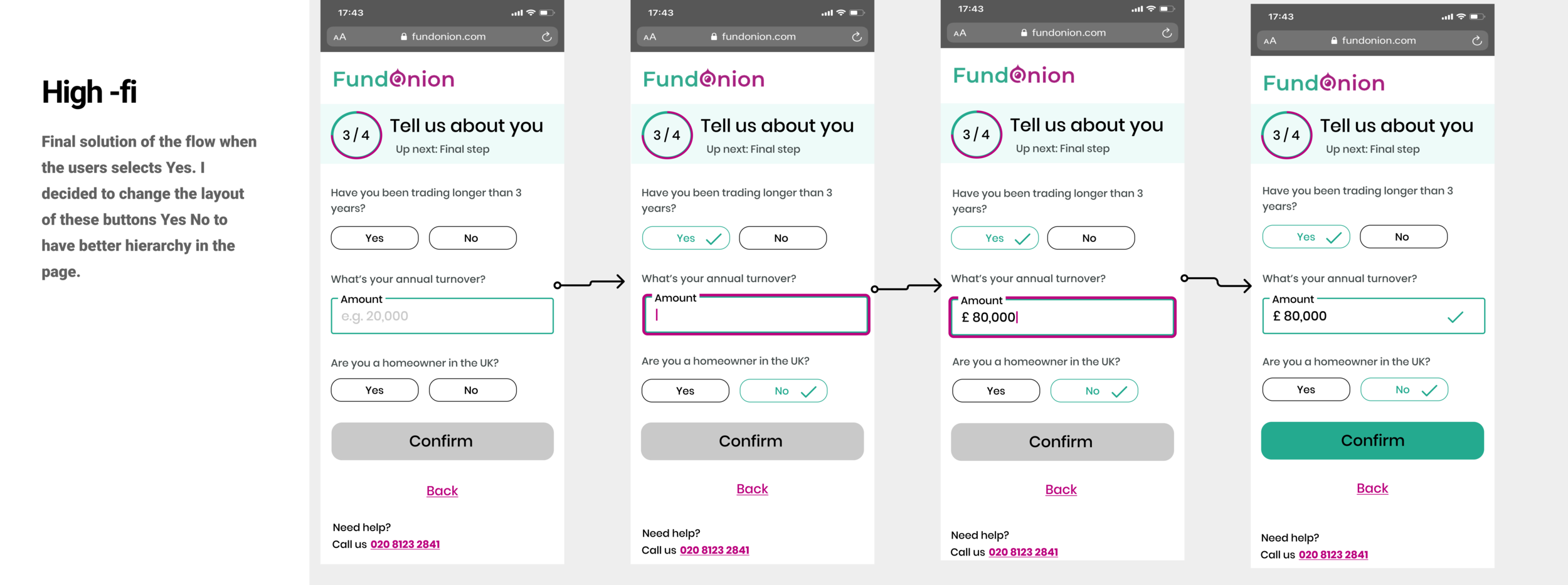
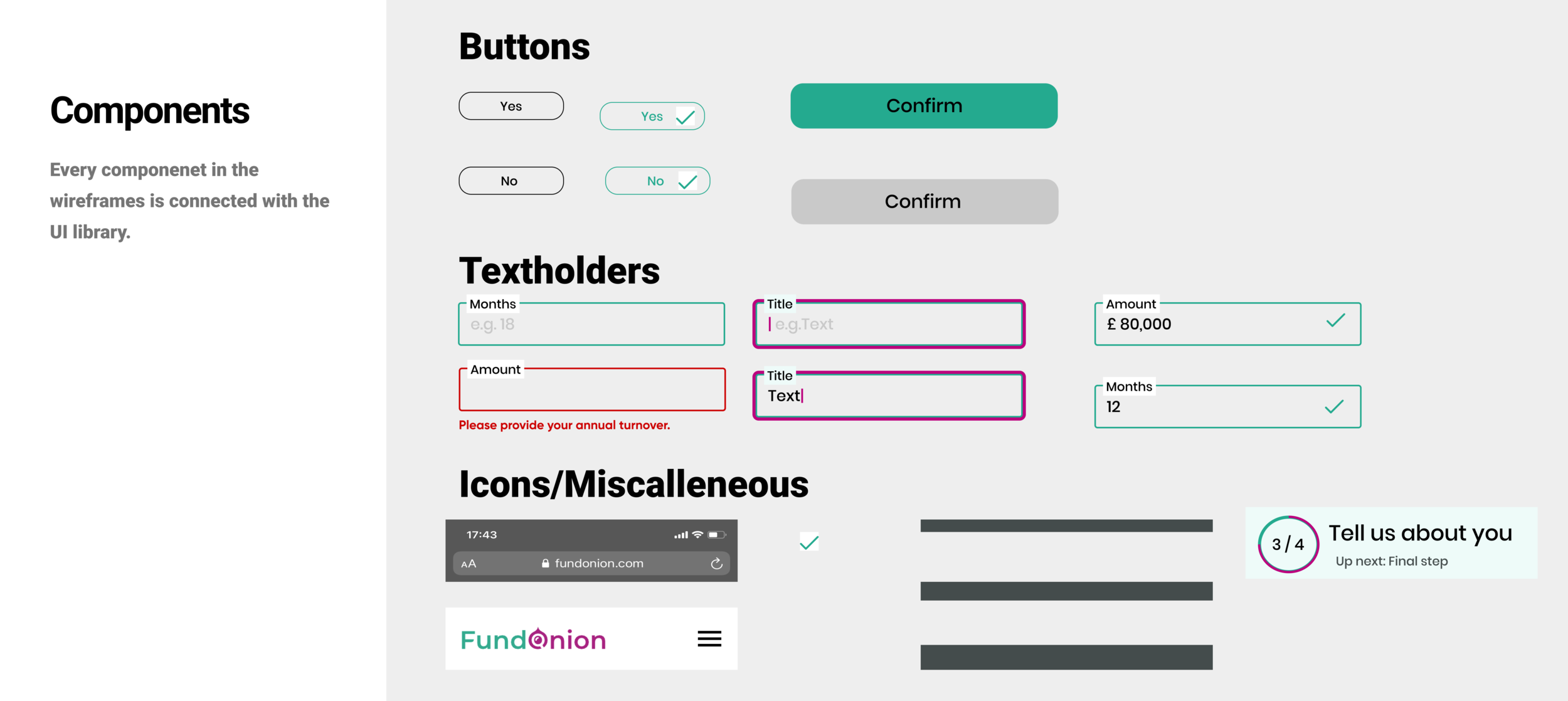
Design System - UI Library
Next steps
Some of the changes have been implemented and the company tracked them and saw that they have helped the user flow
Some changes was not possible to be implemented due to restrictions from the platform that the site was build